Spider-Man: Across the Digital Art Style and Ben-Day Dot Restoration in High-Fidelity 4K
A Living Comic Book: The Visual Language of the Spider-Verse Multiverse and Beyond
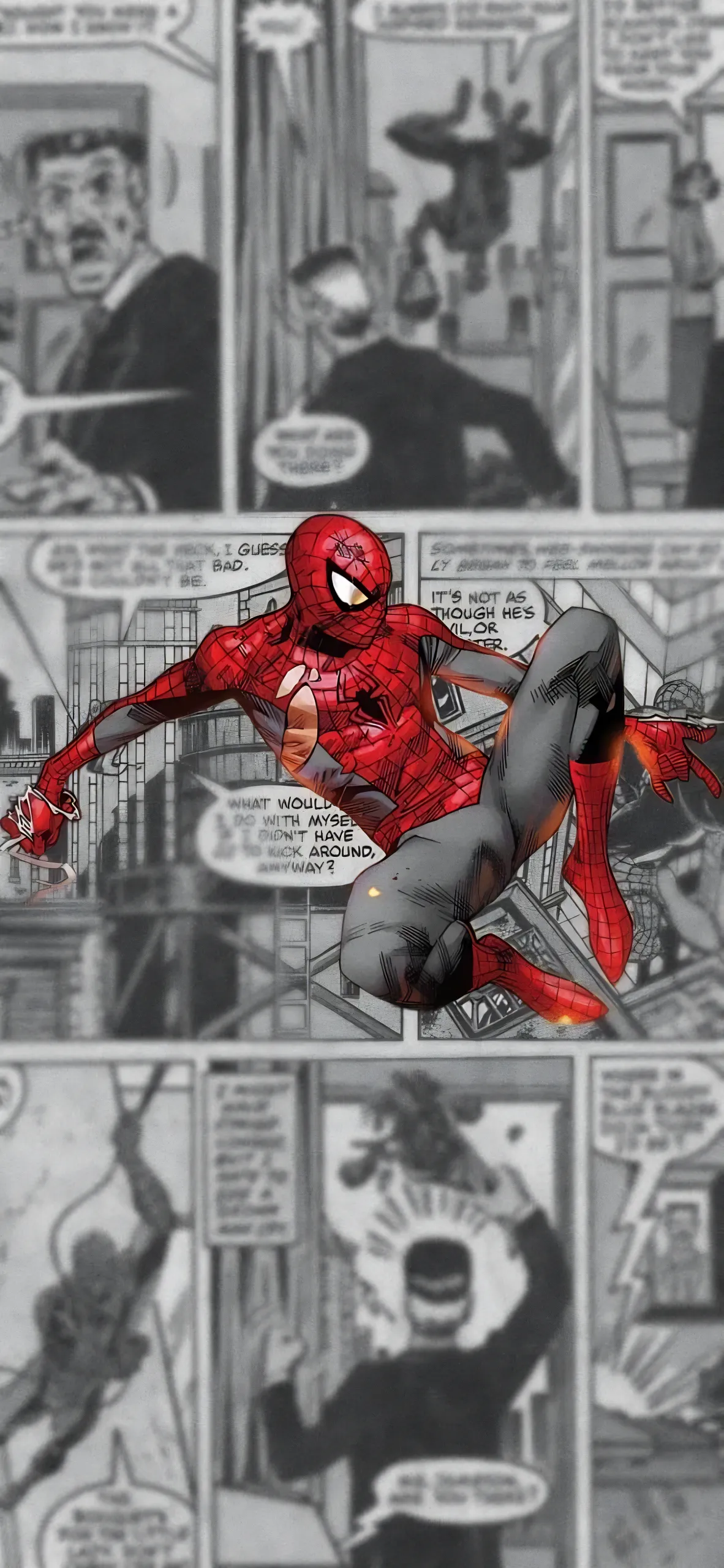
The Spider-Verse movies are a visual overload in the best way possible. They aren't just movies; they are a love letter to the history of comic book art, street art, and graphic design. The mix of 2D and 3D animation, the use of Ben-Day dots, the chromatic aberration (color fringing), and the shifting frame-rates make every single frame a potential masterpiece. As a wallpaper creator, these movies are my favorite source material, but they are also the most difficult to work with. You can't just treat them like a normal anime or a live-action film. They have their own set of rules and a unique "hand-drawn" feel that is easily lost in digital processing. It's about bringing the spirit of the page to the digital screen in 4K resolution.
The Upscaling Nightmare: Saving the Comic Texture from AI Smoothing Artifacts
Here's the technical problem that most amateur editors face: AI upscalers hate Ben-Day dots. Most AI models (like Gigapixel AI or Real-ESRGAN) are trained to remove "noise" and smooth out gradients to make images look "clean" and sharp. They see the beautiful comic book dot patterns in Across the Spider-Verse as "mistakes" or "compression artifacts" and try to delete them. If you run a Spider-Verse frame through a standard upscaler, you get a weird, smoothed-out, plastic mess that looks like a cheap mobile game. It loses all the charm and the "multiverse" feel. To fix this, I had to develop a very specific, manual restoration workflow that I'm sharing today. It's about preserving the art, not just upscaling the pixels.
I upscale the image using a standard "Photo" model to get the sharp edges of the characters and the silhouettes, but I also keep the original low-res version. I place the original version on top of the upscaled one in Photoshop and set the blending mode to "Luminosity". This brings back the original dot texture and the hand-drawn ink lines while keeping the sharp, 4K edges of the upscaled version underneath. It’s a tedious, multi-layered process that takes about an hour per wallpaper, but it’s the only way to get a high-res Spider-Man wallpaper that actually looks like the movie and not a digital approximation. I want the texture to be visible even on your phone's small screen. You should feel the paper and the ink. It's about authenticity.
Color Grading the Multiverse: Gwen Stacy vs. Miles Morales Unique Visual Styles
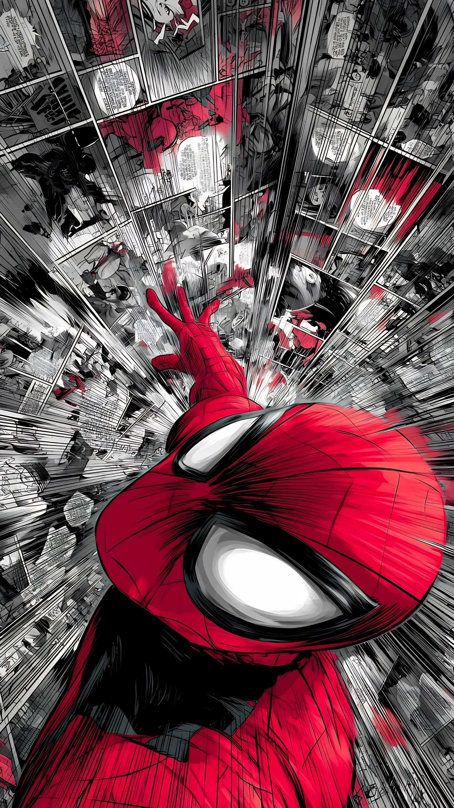
Every "world" in the Spider-Verse has its own unique color palette and emotional tone—Gwen's world is a watercolor pink and purple dreamscape, while Miles' world is vibrant street-art colors with heavy contrast and neon energy. I use Gradient Maps to enhance these specific palettes and make them "pop" on modern screens. I want Gwen's wallpapers to feel soft, emotional, and painterly, while Miles' wallpapers should feel punchy, energetic, and urban. I also manually "nudge" the red and blue channels to create that signature "out of focus" chromatic aberration look that gives the movies their incredible depth and 3D feel. It's about bringing the multiverse to your tech setup. It's art from across the dimensions.
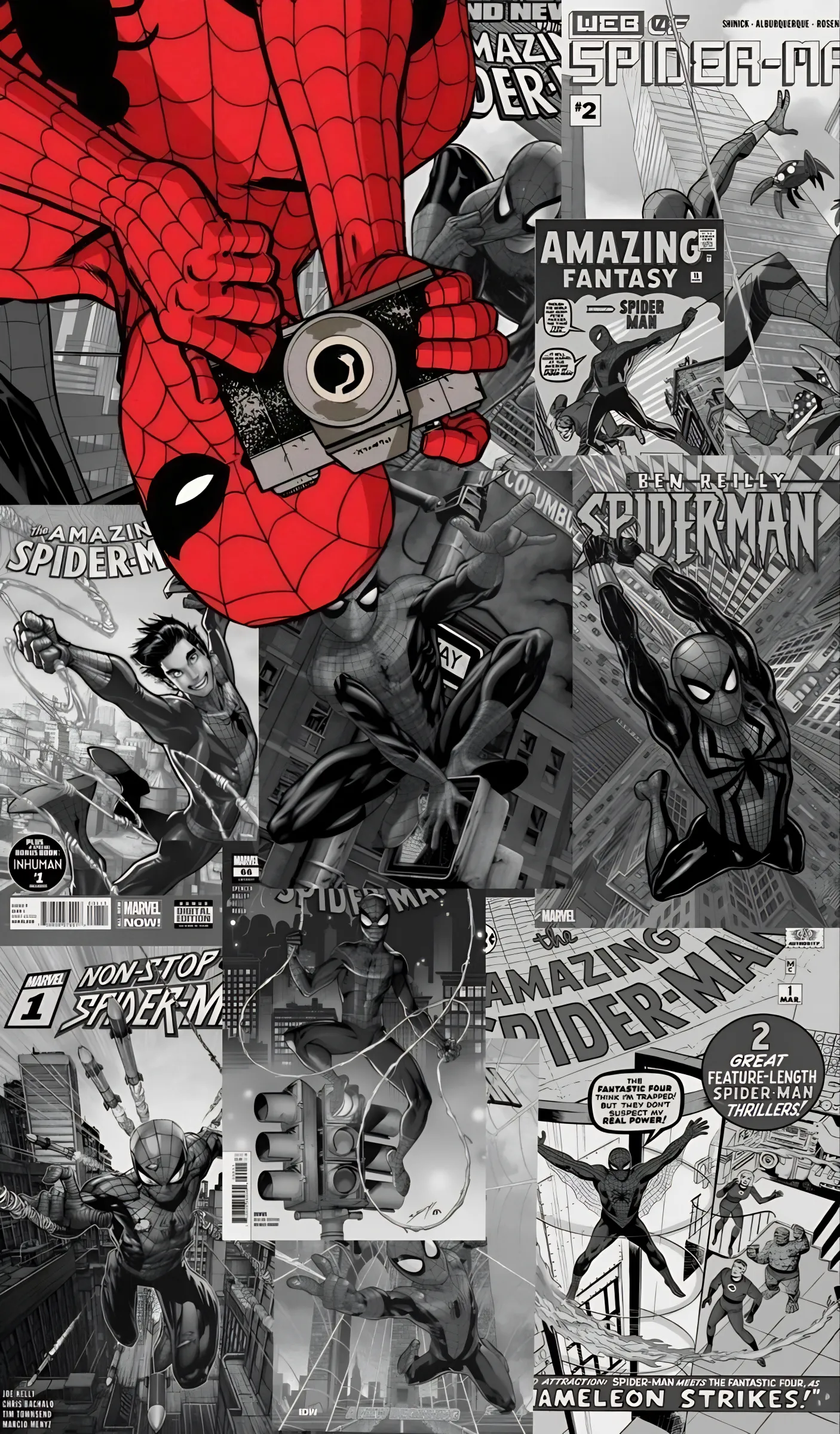
The Spider-Verse 4K collection is now live, featuring Miles Morales, Gwen Stacy, the intense Miguel O'Hara (Spider-Man 2099), and the spectacular Hobie Brown (Spider-Punk). These are the highest-fidelity Spider-Verse wallpapers you'll find anywhere on the internet. Go grab them and let your screen swing into the multiverse! I'll be adding more "Spider-Society" shots soon, so stay tuned for the next drop! Your setup is about to get much more spectacular!